Problem
Defy is a branding agency based in Philadelphia that launched a rebrand in 2020 and a new website to go along with it. Sadly that site was difficult for users to navigate and was therefore not getting the traction it was intended to. Data showed that users were clicking out of the site within seconds and failing to find a way to easily contact the team
As a digital designer at Defy I was tasked with finding a solution to the website’s woes. Our initial instinct was to keep things light by simply redesigning the most integral components of the site such as the contact form and navigation. The previous site employed a layout with 2 separate columns that scrolled independent of one another. One column held “about” information as well as job openings and even the contact form. While the other column housed the agency’s work and client list. As we began to build solutions in these areas it became clear that the issues of the site ran too deep to only apply band aid solutions.
After some deliberation, we decided upon a full redesign of the site. User experience concerns were at the heart of this project, but this also became a great opportunity to implement some of the new brand direction that had developed since the previous site launched. The goal of the new site would be to inform people about what Defy does and how they can get in contact with the team about previous work or more important future projects.
Architecture
A major concern for this project was to make sure that all information was easily accessible to the user. The previous iteration utilized a confusing navigation with major links in all 4 corners of the viewport as well as “easter egg” links that were the only route to important information. In order to account for all the content we wanted the site to present, I created a site map. This allowed us to get a bird’s eye view of the site architecture as well as begin to decide which pages would need to be most prevalent in the navigation. The site map also revealed how many unique page templates are going to be needed for the site.

Wireframes
After determining what the unique pages would need to be,I begin gray box low-fidelity wireframing. The purpose of this exercise is to design out the user experience and user flows, not how things will look. Layout, navigation, and ease of use are the focal points here. It’s important to begin prototyping in this phase as well to make sure that all pages have the proper navigation. This assures that users won’t get lost or confused when moving about the site. During this process it becomes easy to identify similar components across layouts. These are opportunities to reuse elements in order to maintain consistency.

The team reviewed my low fidelity wireframes and upon approval, I incorporated the feedback as it pertained to user experience concerns. At this point visual design is being considered a little more. Improvements were made to navigation systems, layout, content layout, etc. in order to make sure the user would never be confused and would be able to access the information they needed. Placeholder images, button styles, and typography are added in to start to give a feel for the aesthetics combining with the user experience.

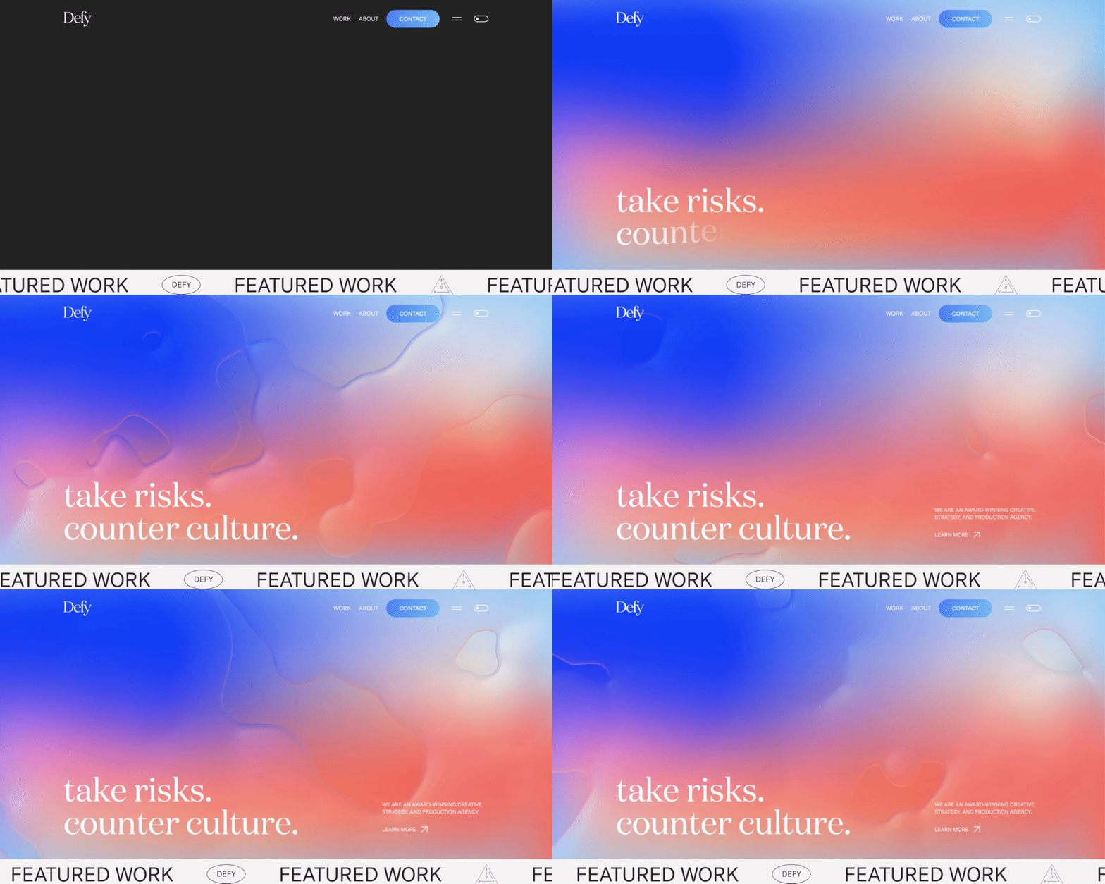
After another round of feedback, final decisions about user experience were made. At this point the visual design can begin. It was very important to incorporate elements from the new brand direction as things had progressed since the rebrand launch in 2020. Utilizing the new gradient styles, sticker designs, pill shapes, and marquee text ribbons were all part of expressing this new direction.

The wireframes were brought to a high level of polish and critiqued until the larger team believed they were at a place where we could hand it off to the development team.
Dev Handoff
This entire project was built in Figma and was therefore handed off by sharing the files on Figma directly. I also created an annotated PDF of the designs that noted where and how things were supposed to move as well as explain components of the site that may be confusing without context. The last thing I created to assist the dev team was a reference list for animations that linked to points on the site where these animation styles could be used.

The development process was very collaborative. We shared notes on Figma directly constantly as well as QA’d the site several times and provided feedback to them directly. After a few rounds of this process, we were all happy with the final result and the site was launched.


Results
Once the site had been completed and published we began to run ad and email campaigns to get traction and feedback. Our response and engagement numbers have never been higher. Users are finally finding it easy to learn what we do and how to contact us.

