Newsela.com was underperforming at every level: traffic down 32% year-over-year, a navigation structure that broke down across sub-sites, and accessibility gaps that shut out real users. I led this project end-to-end as the sole designer, partnering closely with marketing, product marketing, product, sales, and web development to audit the entire site, update its architecture, and design and maintain refreshed components and modules.
Auditing the problem
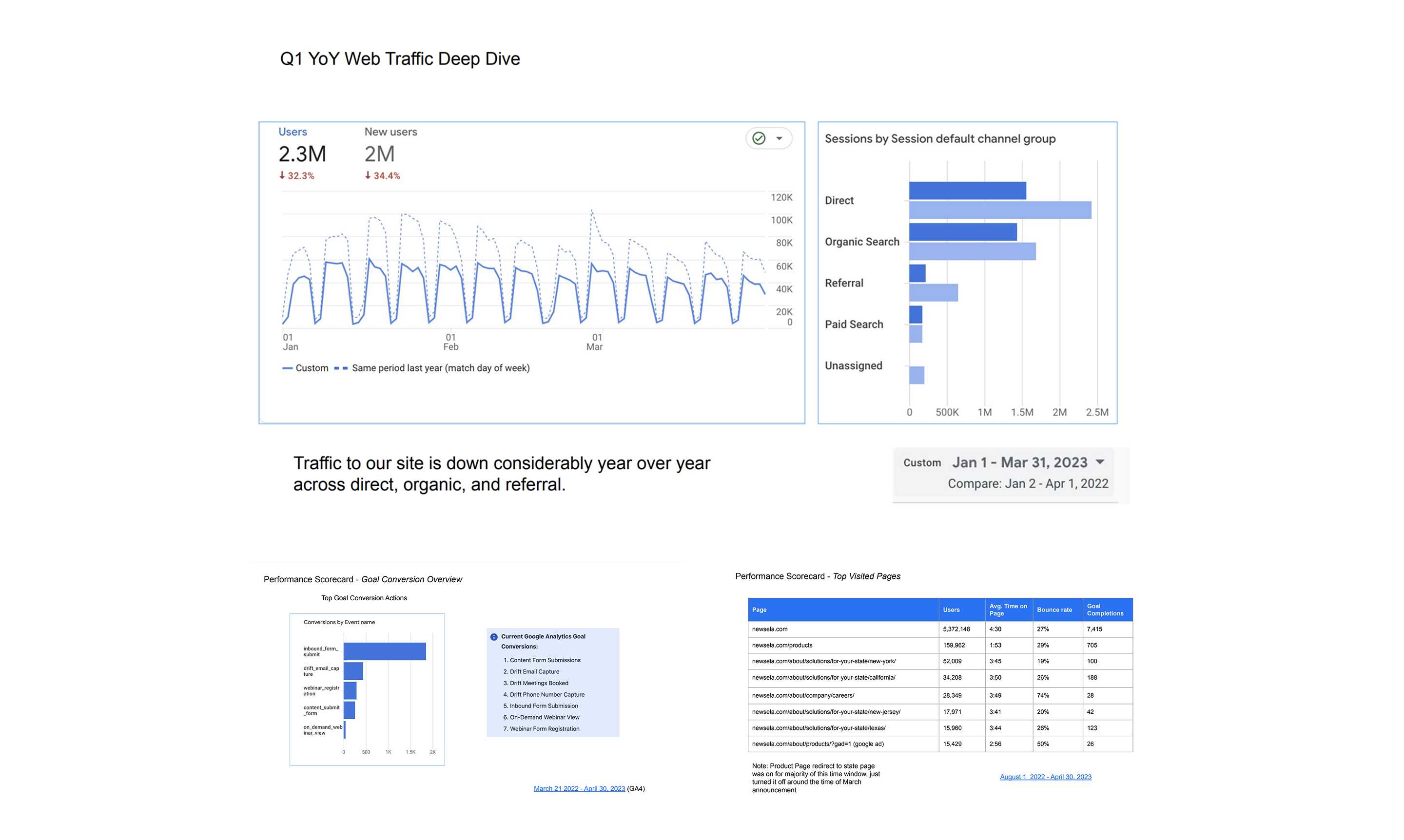
The performance scorecard made the scale of the problem concrete: users down 32.3% year over year, new users down 34.4%, alongside a goal conversion overview and a look at the top visited pages that showed where visitors were actually landing versus where we wanted them to go.
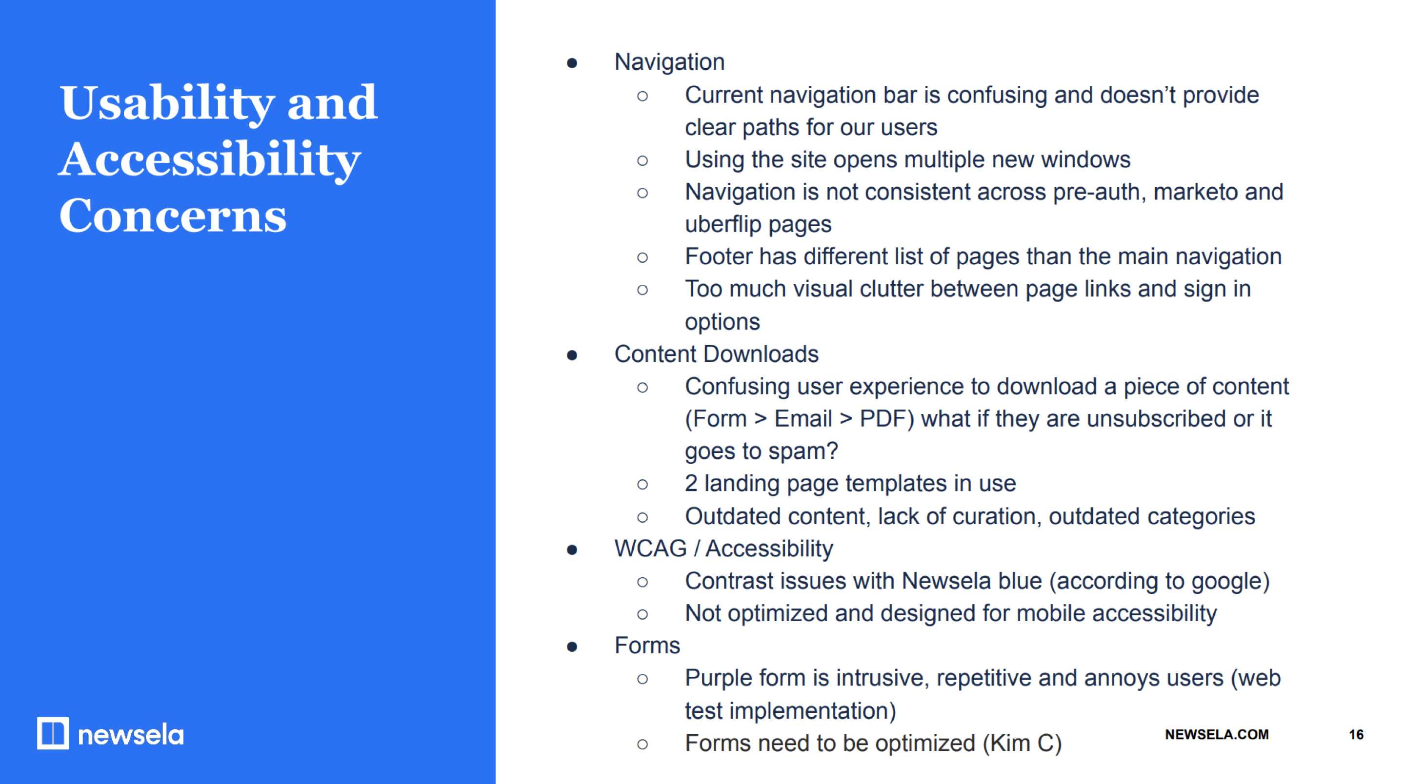
The usability and accessibility audit surfaced the specific issues driving that decline: a confusing navigation structure that opened multiple new windows, inconsistent experiences across the pre-auth site, Marketo pages, and Uberflip content, mismatched footers, visual clutter, a confusing content download flow, WCAG contrast issues with Newsela's own blue, a site that wasn't optimized for mobile, and forms that interrupted the browsing experience more than they helped it.
Rebuilding the architecture
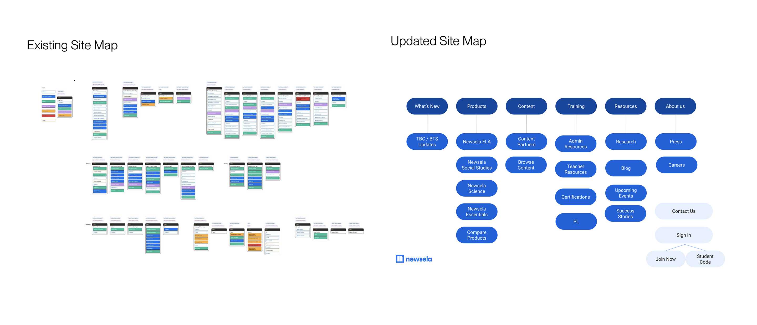
Alongside a competitor analysis of sites like Actively Learn, CommonLit, and Calm for Business, the audit led to a full rework of the site map, collapsing a fragmented structure into a simplified hierarchy organized around What's New, Products, Content, Training, Resources, and About Us.
The audit gave us a punch list, but the real work was the three years that followed. Newsela.com was a living product, not a project with an end date. We kept coming back to four design pillars: emphasis on brand and product story, product pages that show rather than just tell, navigation people can actually use, and trust built with data and real world use.
Telling the product story
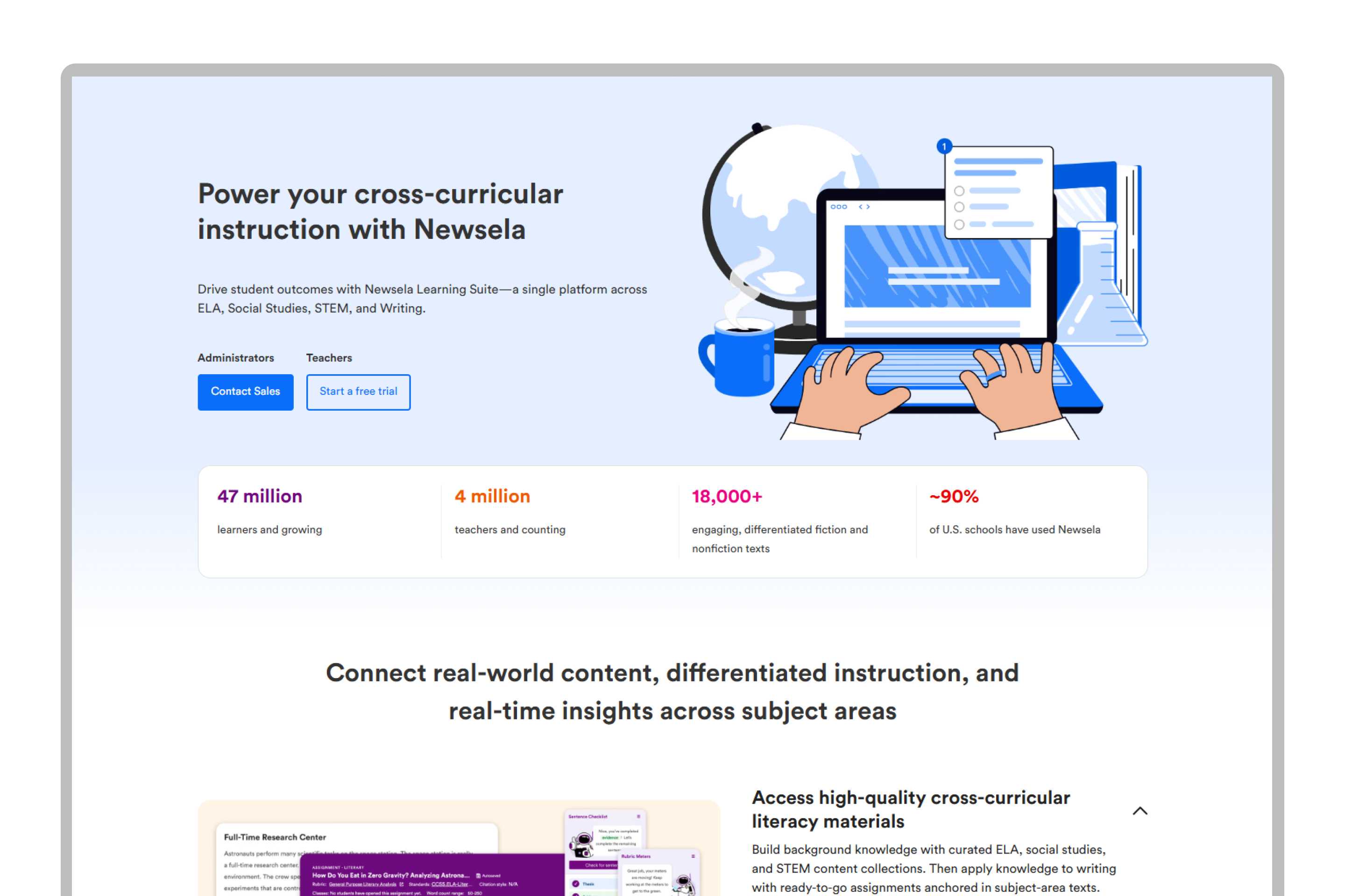
The redesigned homepage led with the Newsela Learning Suite story ("Power your cross-curricular instruction with Newsela"), backed by real numbers: 47 million learners, 4 million teachers, over 18,000 texts, and roughly 90% of US schools reached.
Navigation people can use
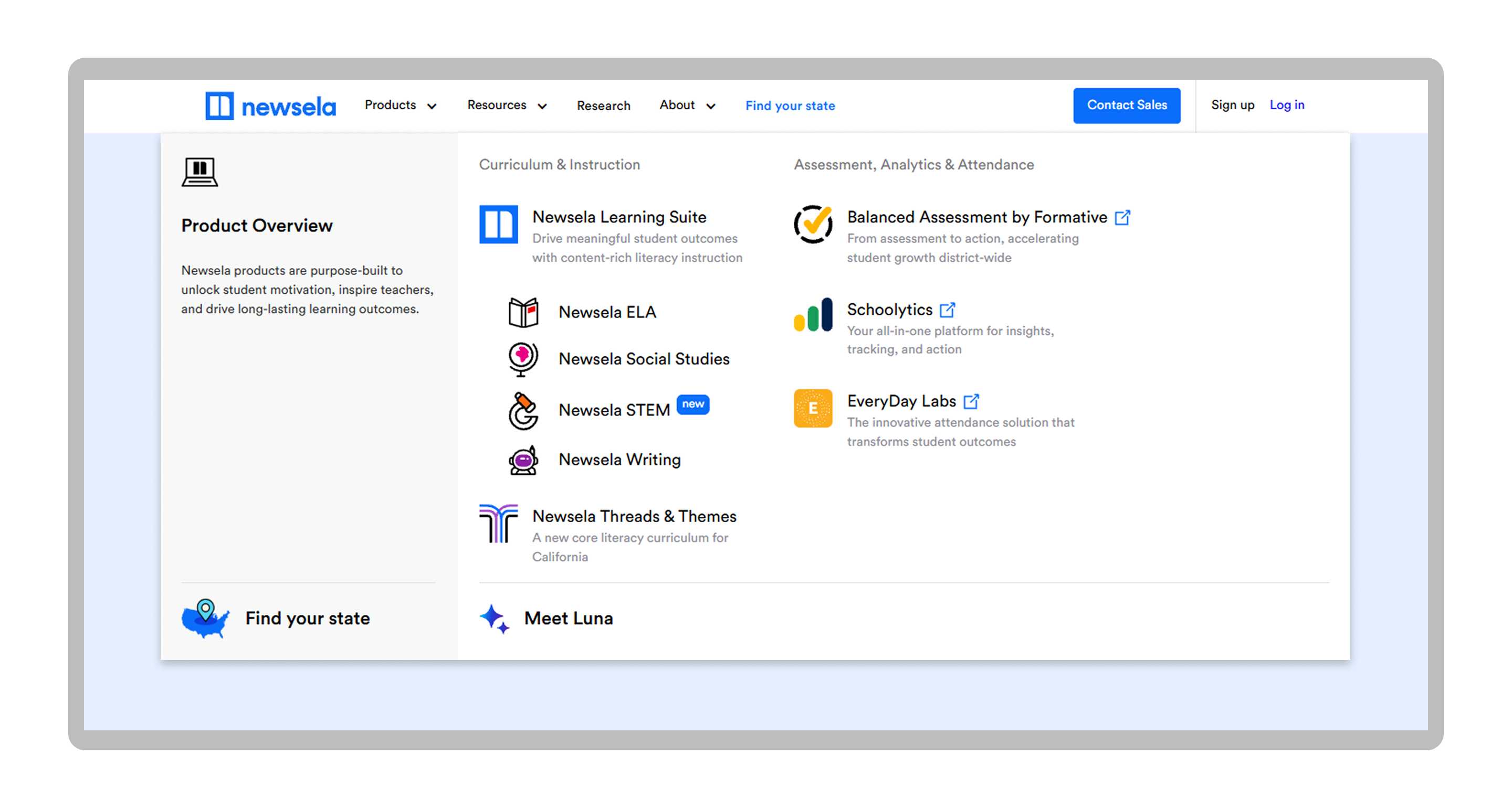
The new navigation replaced the old structure with a mega menu organized around how customers actually think about the product: Product Overview, Curriculum and Instruction, and Assessment Analytics and Attendance, all in one clear, scannable layout.
The live site
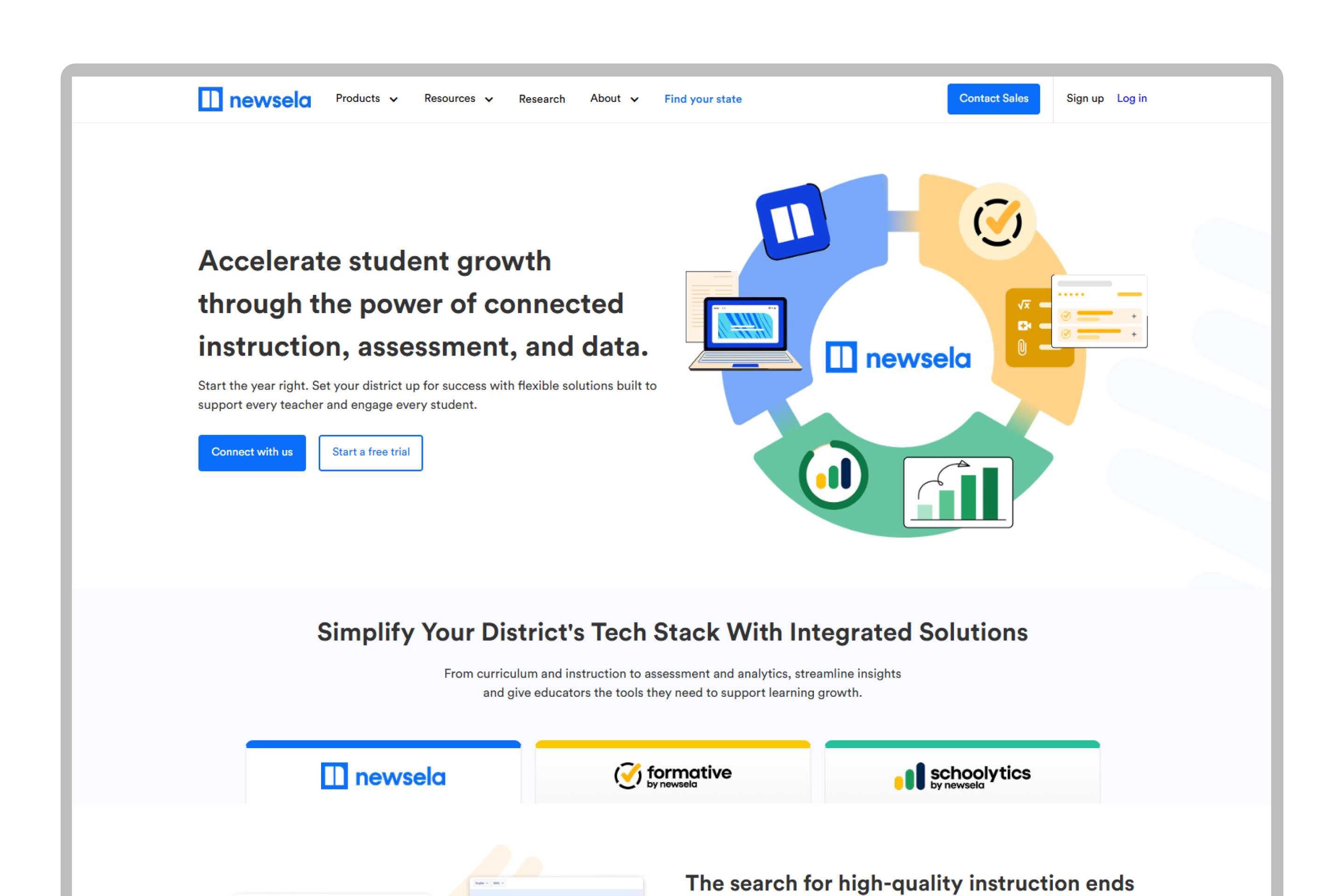
The result is a homepage built to earn trust as much as explain the product, backed by logos from over 1,000 districts and testimonials from real educators, and landing on a single clear promise: accelerate student growth through the power of connected instruction, assessment, and data.
This wasn't a one-time redesign so much as an ongoing design practice. Newsela.com kept evolving for three years after the initial audit, and every product launch, from Luna to Newsela STEM, shipped through the same navigation, component library, and design pillars this project established.